
NYU Class Enrollment Portal Redesign
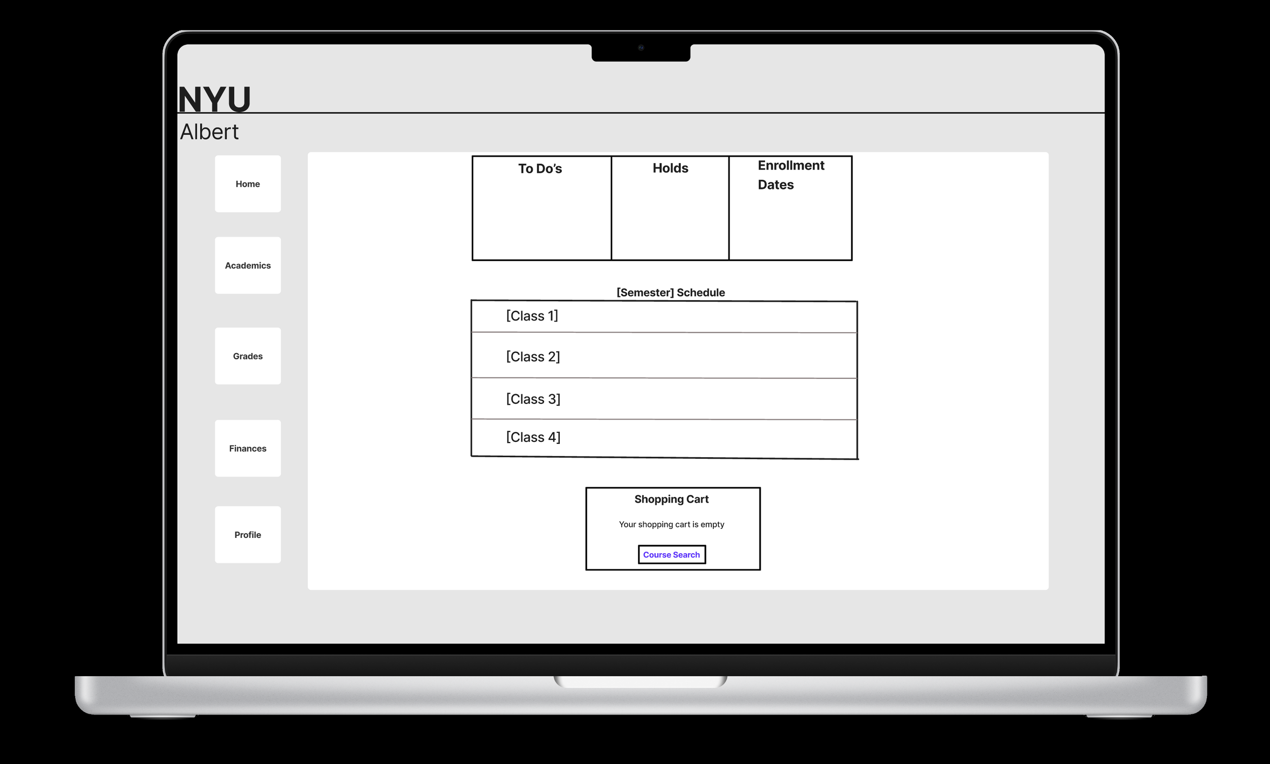
For this UX research project, I focused on redesigning NYU's Albert class enrollment portal, which I found to be extremely difficult to navigate. The existing portal crammed everything onto a single page with tiny, compressed text, forcing users to scroll endlessly to find classes — with courses and sections listed so close together they were hard to tell apart.
To validate the problem, I conducted user interviews and found the frustration was widespread. Students described the portal as chaotic, with buttons and text "all over the place" and the class listing feeling "hectic." I also ran a comparative analysis against Rate My Professors, the NYU Bookstore, and the NYU Library to understand what better-designed platforms had in common.
The key takeaway was clear: sites that separated information into distinct categories, each with its own page, were far more readable and easier to navigate. I applied that principle to my redesign, creating a class enrollment flow that breaks the process into three dedicated pages — Major, Class, and Section — so users always know exactly where they are and what they're enrolling in. I built a working prototype in Figma to demonstrate the concept. View prototype here.