
Eclipse Soundscapes Website Redesign
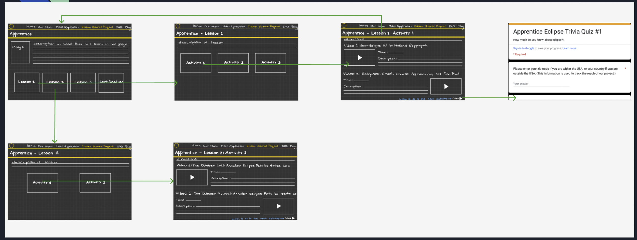
For this project, my teammates and I redesigned the NASA-partnered company Eclipse Soundscapes Apprentice Training page with a focus on making it more accessible and engaging for younger users between the ages of 13 and 30.
Going in, we immediately noticed several usability issues: the page required excessive scrolling, had no clear visual hierarchy, featured buggy embedded Google Forms, unevenly spaced videos, and took a long time to load. Our user interviews confirmed these pain points — nearly every person we spoke with disliked the infinite scroll format and found the sheer volume of content on screen overwhelming. A clear pattern emerged across all our interviews: users instinctively look for a title or navigation structure first, and this site made both hard to find.
We also spoke with the client to clarify the site's goals, learning that the intention was to create a single accessible experience for a broad range of ages — not separate versions for different groups. That shaped how we approached the information architecture: rather than stripping content, we reorganized it using a multi-tab structure to reduce overwhelm and create a clearer learning environment.
We drew on a competitive analysis of NASA, National Geographic, and NYU Brightspace to guide our wireframe, pulling best practices around section division and readability. Our next steps are to conduct user testing across the target age range, build out a full prototype, develop a color scheme, and ensure the redesign meets accessibility guidelines. Few presentation here.